 into my window for my front cover. I then created my text for my website and date (I already knew what style I was going to use for my front cover as I had already look at different style of text and which to use). To create my text i used the 'Horizontal Type Tool'
 , and changed the font/style of the text by selecting my text using the 'Horizontal TypeTool' and clicked on the drop-down arrow and selected the style of text I wanted.
  I then clicked on this tool
  to change the colour of my text, I then clicked on this tool
  to change the size of the text. I then used the same technique for my sell-line and other sell-lines, but the next step for my main sell-line was to add a drop shadow to do this I selected the text using the 'Horizontal Type Tool', right clicked on the layer in my 'Layers', selected the 'Blending Option...', I then selected the 'Drop Shadow' option when the box came up, and changed it so that the white text would stand out against the background.
I then needed to add my image(I had already edited my image in another window), to do this I opened up my image in another window, I then selected the image using this tool
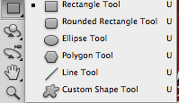
 , I then dragged this image from it's window to my image, I then pressed 'Command' and 'T' on my keyboard to re-seize it, so that it would fit. I then added my a bar code to do this I went on the internet and searched for a music magazine bar code and I then copy and pasted it into my window, and selected the layer, then pressed 'Command' and 'T' on my keyboard and resized it to fit. By putting this on I realised that I needed to add a box, so that you could see the bar code, to do this I selected the 'Rectangle Tool'
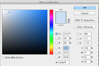
 and shaped it to fit around my bar code. I then double clicked on the box in my 'Layers' and selected a white colour so that it would keep in with my colour palette. After doing this I realised that I needed to add a background colour as it looked too bare, so I added a box, using the 'Rectangle Tool' and shaped a box to make up the background. To change the colour I double clicked on the layer in my 'Layers' and changed the colour to blue.
 My last step was to save my product as a JPEG and upload it to Blogger.
No comments:
Post a Comment