 and changing the size of the text by using the drop down arrow
 .
.I then changed the style of my pull quote, by clicking on the 'Horizontal Type Tool',

clicked on the text, then I clicked on the drop-down arrow for the fonts
 , then changed the colour of the colour of the text by dragging my masthead from another window to my double page spread window, using this tool
  , then I clicked on the colour tool
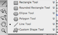
 and clicked on the colour I wanted. After this I changed I selected the line tool
  and held shift down whilst I created the line down the middle of the page, to create two pages. I then deleted the box, so that it would look professional. I decided to select the 'Horizontal Type Tool', so that it would be another layer, to create my drop capital so that I could move it and change the size, colour etc, in any way I wanted to. To create the pull quote I used the 'Horizontal Type Tool', and changed the surrounding tool so that it would look like a professional interview article from a music magazine.
I then added more text so that I would have 3 columns on the left, like a typical music magazine interview would have, adding pull quotes as I went, using the same technique I used for the previous pull quote and one column on the right hand side of the page.
I then decided to add the contents page numbers by selecting the 'Horizontal Type Tool', changing the colour and size the way I did it for the other text. After this I then added the photo that I had edited and had in another window, I then dragged it to my double page spread window by using this tool
 . I also used the same tool so that I could have my masthead on my double page spread from my front cover. To create the shadow behind my model I went back to the window from where I got my edited image from. I then selected the 'magic wand' tool
  , I then clicked 'Select', then 'Inverse' (shift, command,I), I then used the 'Brush Tool'
 , going over the areas selected so that it would create a black silhouette. I then changed the opacity on it by right clicking on the image, clicking on 'Blending Options...' and changing the opacity on the image, to make it look like a shadow.


No comments:
Post a Comment