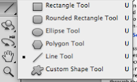
To start off my contents page I decided to use the same background and masthead, so I dragged both from my front page window using the this tool

and dragged it to my window, so that my magazine held consistency/continuity and so that my target audience would be able recognise my product. I then clicked the 'Horizontal Type Tool'

and created the date and website. I also tried to keep continuity I used the same style/font as my front page, to change the font style I clicked on the drop-down arrow and selected the same font as my front cover

, to change the font colour I used this tool,

and to change the font size I used this tool

, however to do these tasks i had to click on my text using this tool

. To create my main sell-line I used the 'Horizontal Type Tool', and used the same technique I have just used for my websites and date. I then decided to add a drop shadow so that it would look similar to my other front cover, by using the 'Horizontal Type Tool', clicked on the piece of text I wanted the right clicked on the layer

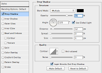
, I then selected the 'Blending Options...', then when the box came up I selected the 'Drop Shadow' option, then I changed it to what I wanted it to be:

. To create the other sell-lines I selected the 'Horizontal Type Tool', using the previous method I have just done to change the style/font and size, but I changed it so that it looked exactly like my original front cover, to keep consistency. To create the style of font I had for the other sell-lines I changed the 'Outer Glow' (to get to this I used the same method that I had used to create my drop shadow, except I clicked on the 'Outer Glow' and changed it to create the effect that I have).

I then needed to add my image that I had edited in another window, to move my image I selected this tool

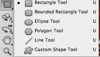
, and dragged the image from that window to my window. I also needed to find a music magazine bar code, so I looked on the internet and found a bar code, to this I copy and pasted my image into the window and pressed 'command' and 'T' and re-sized it to fit. But after doing this I realised that you wouldn't be able to see the bar code because of the image, so I made a white box, to create this I clicked on the 'Rectangle Tool'

and created a box to fit around my bar code. I then double clicked on the box in my layers and selected a white colour, so that it would keep in with my colour palette. I then added the price for my magazine by selecting the 'Horizontal Type Tool', then typed and then I changed the size, font/style and colour, the same way I have done for the previous text layers. My next step was to save my image and convert it into a JPEG and upload it to Blogger.


