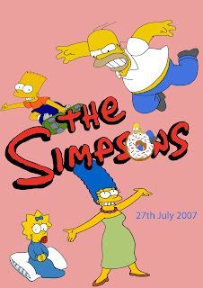
To make this I searched for 'The Simpsons' logo from Google. I then pasted it into Photoshop, then I erased all of the other the colours that surrounded it. I then erased the 'o' out of 'The Simpsons' to add in the doughnut with Homer eating it. I then enlarged it so you could read the title, then positioned it to the middle so I could add in the characters on the top and so it didn't look empty. I then added in Homer, taking out the white background around him so that I could add in the background later. To do this I used magic wand tool and highlighted the pieces I didn't want, then pressed delete. I then pasted in Bart, from Google, but before I could continue I had to take out text and the original background around it by using the magic wand tool, I could also have used the eraser tool, but the magic wand tool allowed me to get closer to the image and erase things more easily and quickly. I then highlighted Bart's layer then moved it so it was behind 'The Simpsons' logo. I then selected it so that I could changed the angle of him to suit the text. Next, I got an image of Maggie from Google, took out all the background behind her with the magic wand tool and the eraser tool for the bits that the magic wand tool missed and what I wanted out. I then selected Maggie, then turned her around so that she faced right, rather than the left hand side of the screen, to make it look like she fitted in to the poster. I then added in Marge, taking out the background around her with the magic wand tool. I then put it behind the title so you could still see the text. I then added the date to it, using the text tool and changed the colour of the text by highlighted the text, selected the colour palette, then chose which colour would go against the other colours. Lastly I changed the background colour by going on the background, clicking on the colour palette, I then chose the colour I wished. Lastly I saved the image as a JPEG and uploaded it to Blogger.
To improve my poster I could have choosen a better background colour as pink isn't really the colour palette that 'The Simpsons' use. I also could have had more characters/images in this so that it didn't look as empty or I could have made the characters/images bigger so that it filled up the screen more.

Rachel
ReplyDeleteYou have successfully complete the movie poster task and have identified areas that you could have improved. Hopefully you are now feeling more confident using Photoshop to create images.
Gary