Thursday, 4 April 2013
Wednesday, 3 April 2013
Evaluation Question 7
This is question 7 for my AS Media Evaluation.
7. Looking back at your preliminary task, what do you feel you have learnt in the progression from it to the full product?
Evaluation Question 6
This is question 6 for my AS Media Evaluation.
6. What have you learnt about technologies from the process of constructing this product?
Saturday, 23 March 2013
Evaluation Question 5
This is my response to Evaluation 5: How did you attract/address your audience?
I have also received responses from Facebook for my final media product and you can see the comments below:
You can also look at the 'Facebook Feedback on Final Piece' which contains the feedback and my response, by clicking on the below link:
http://rachelblack2496.blogspot.co.uk/2013/03/facebook-feedback-on-final-piece.html
Friday, 22 March 2013
Evaluation Question 3
This is question 3 for my media as evaluation for my media product.
3. What kind of media institution might distribute your media product and why?
Evaluation Question 2
This is question 2 of my AS Media Evaluation.
2. How does your media product represent particular social groups?
Evaluation Question 1
1.
In what ways does
your media product use, develop or challenge forms and conventions of real
media products?
Front Cover
For my masthead I
looked through different fonts/styles, but decided to use ‘MoolBaron’ font
because it gave the connotations of professional and elegant, which I believe
my target audience are like. (LINK)I also chose this style of text because
it was clear, easy to read and from my research I found out that they usually
use black font, for example ‘Billboard’ magazine uses a black font with
different colours in the counters. I also found from doing this research that
they sometimes put the masthead behind the image when it is a well-known
magazine, so I have kept to those conventions.
However I have challenged media forms for my media product as well as keep to them as I have created a music magazine with a unique selling point; a music magazine, which is dedicated to undiscovered artists/bands so that they can become discovered without the aid of talent shows. From doing my audience research I found that there was already an existing market for my media product as I uploaded a questionnaire for my target audience (14-21 year old females) to fill in, and found that they thought it was a good idea and that it would be a ‘Good way to find out about new music’. (LINK)
I have also challenge and develop conventions for my front cover by
putting my websites at the top left hand side of the page, as real magazines
usually put their websites with the bar code, however I decided to put it there
so that it filled the space, it looked similar to the right hand side of the
page, and I wanted it to be seen, because when you look at real music magazines
you can’t really see what the text says, and as my media product would also be
digital, it would be in my interest to make it easily visible.
For my contents page I decided to use the same style of layout, which ‘Q’
magazine used for their October 2008 contents page, so that I keep to music
magazine conventions. I have also kept to music magazine conventions by using a
long shot of my model, as this is what they do in music magazines, so that
readers are drawn into the page, so that they can identify who the
person/people in the image is. I have also kept to conventions for her costume,
as when you do a music magazine, you need your model to wear the same colours
from your colour palette that you have chosen for your magazine, so that it
looks consistent and professional. For the background colour behind my model I
decided to keep to my colour scheme by using a blue shade for my background. I
also decided to use the same colour as my front cover for my contents page
background so that it kept consistency in my magazine and looked professional.
I have also tried to use a very limited colour for the rest of my contents page
so that it is stripped back and professional looking, but also so it appeals to
my target audience and so that it gives connotations that it is for young
adults. (LINK)
For my cover lines for my contents page I decided to use large numbers
(38/46) instead of small numbers (1/2) as this is what they do in music
magazines such as ‘Q’ and ‘NME’. I did this so that I kept in with music
magazine conventions. Another way in which I have used this magazine (NME) to
create my music magazine is that ‘NME’ tell their readers that they could
subscribe to that magazine. I decided to use this because music magazines that
do this are usually wanting to promote their magazine, so that the target audience
buys more than one issue rather than buying that issue for that specific thing
in that article at the time. I have also done this so that my target audience
would be kept up-to-date with undiscovered artists/bands.
Another way in which I have
used a cover line called ‘EVERY MONTH’, as this is what they do in ‘Q’
magazine, so that it kept in with music magazine conventions. I also wanted to
use this cover line so that my target audience knew exactly what my music
magazine was about and what it contained, as this is what my unique selling
point is, so I wanted my target audience to buy my music magazine for the right reasons.
I have also created a contents page number on the right hand side of the page, alongside the page number so that my target audience know which magazine the contents page is, also so they know what page umber they are on as this is what they usually do in music magazines.
Double Page Spread
For my front cover I have
again stuck to music magazine conventions as like the double page spread I have
used put my image to the right hand side of the double page spread, the pull
quote (title) is big on the page and I have also put a little introduction to who
Ally Rhodes is. Another way in which I have kept to music magazine conventions
is that I have used pull quotes, a drop capital at the beginning of my article,
and on a double page spread they usually use 3-4 columns per page, so this is
what I did for my double page spread. I have also put page numbers at the
bottom of the page, as this is what they do in music magazines, along with the
masthead. Another way in which I have kept in with music magazine conventions
for my media product is that the number for my double page spread is high,
because they don’t usually put the main sell-line article at the beginning, and
is usually in the middle. (LINK)
I have also kept to my colour scheme for my double page spread so that
it kept consistency throughout the magazine and looked professional. For my
model for my double page spread I have got her to wear a different costume so
that she looks different, however I still got her to wear black and red so that
it kept to my chosen colour scheme.
For my double page spread
image I decided to use a long shot so that people would be drawn into the
article, just like NME magazine, however music magazines typically use close up
or medium close ups as they seem to be more intimate, but I wanted to use a
long shot to give the connotations that my audience would be ‘seeing’
everything about Ally Rhodes and her life, without holding back. For my image I
have also used a long shot as it takes up the page, and breaks up the text,
however still not looking overcrowded on the page. I have also made my model
look over her shoulder and smiling, so that she can be seen and give
connotations of cheeky, fun and happy, despite the her struggles. I have also
added a shadow to my image so that my image linked in with my title (as my
title has a shadow), but also so that it stood out against the text.
For the text for my double page spread I decided to use simple text, so
that my target audience would be able to read it (LINK) and I also decided to
change the colour of the questions as this is what they sometimes do in real
music magazines as it breaks up the page and so it doesn’t seem as long. Also
for my text I have tried to use inspirational words/phrases as this is my
unique selling point for my media product; to have undiscovered artists/bands
in my music magazine so that they can become discovered by my target audience
without the aid of talent shows. This challenges the conventions of a real
media product, but from the research I have collected from my target audience I
have found that they would buy a music magazine with people they don’t
recognize on the front. (LINK)
Friday, 15 March 2013
Facebook Feedback on Final Piece
After the completion of my music magazine product, I decided that I needed to have more feedback on what people really thought of my magazine, as I have put my input in on what I thought they would like and what I like (as I fall into the 14-21 year old female target audience range), and I had put in what they told me to put into my music magazine when I got audience research before I started my actual product.
I have found from this audience research that people like my music magazine. I have also found that I have achieved to appeal to my target audience, that my idea was understood and liked, that people like the artists/bands I have put on, they like the design and the way I have set up my magazine (layout). However I also found that they thought that my front cover looks bare, however this was done intentionally as I wanted it to be stripped back so that the artists/bands stood out literally and metaphorically. You can see the actual feedback I received below:
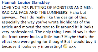
I have found from this audience research that people like my music magazine. I have also found that I have achieved to appeal to my target audience, that my idea was understood and liked, that people like the artists/bands I have put on, they like the design and the way I have set up my magazine (layout). However I also found that they thought that my front cover looks bare, however this was done intentionally as I wanted it to be stripped back so that the artists/bands stood out literally and metaphorically. You can see the actual feedback I received below:

My Music Magazine - INSPIRE: Final Product
I have created a Front Cover, Contents Page and a Double Page Spread for my AS Media and these are the final products below:
Front Cover -
Contents Page -
Double Page Spread -
Construction of Cover For My Music Magazine on the Contents Page
To start off my contents page I decided to use the same background and masthead, so I dragged both from my front page window using the this tool
 and dragged it to my window, so that my magazine held consistency/continuity and so that my target audience would be able recognise my product. I then clicked the 'Horizontal Type Tool'
 and created the date and website. I also tried to keep continuity I used the same style/font as my front page, to change the font style I clicked on the drop-down arrow and selected the same font as my front cover
 , to change the font colour I used this tool,
 and to change the font size I used this tool
 , however to do these tasks i had to click on my text using this tool
 . To create my main sell-line I used the 'Horizontal Type Tool', and used the same technique I have just used for my websites and date. I then decided to add a drop shadow so that it would look similar to my other front cover, by using the 'Horizontal Type Tool', clicked on the piece of text I wanted the right clicked on the layer
  , I then selected the 'Blending Options...', then when the box came up I selected the 'Drop Shadow' option, then I changed it to what I wanted it to be:
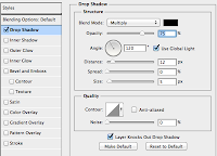 . To create the other sell-lines I selected the 'Horizontal Type Tool', using the previous method I have just done to change the style/font and size, but I changed it so that it looked exactly like my original front cover, to keep consistency. To create the style of font I had for the other sell-lines I changed the 'Outer Glow' (to get to this I used the same method that I had used to create my drop shadow, except I clicked on the 'Outer Glow' and changed it to create the effect that I have).
I then needed to add my image that I had edited in another window, to move my image I selected this tool
 , and dragged the image from that window to my window. I also needed to find a music magazine bar code, so I looked on the internet and found a bar code, to this I copy and pasted my image into the window and pressed 'command' and 'T' and re-sized it to fit. But after doing this I realised that you wouldn't be able to see the bar code because of the image, so I made a white box, to create this I clicked on the 'Rectangle Tool'
 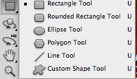 and created a box to fit around my bar code. I then double clicked on the box in my layers and selected a white colour, so that it would keep in with my colour palette. I then added the price for my magazine by selecting the 'Horizontal Type Tool', then typed and then I changed the size, font/style and colour, the same way I have done for the previous text layers. My next step was to save my image and convert it into a JPEG and upload it to Blogger.
Thursday, 14 March 2013
Construction of Double Page Spread For My Music Magazine
Before starting my double page spread I had previously made of draft of what I was going to write in it, so that once I started writing my article I wouldn't be writing something that matched music magazine conventions, as I researched about my artist and how to structure and present my double page spread.
Firstly, I changed the page set up so that it was a landscape, to do this I pressed 'Custom', by using the drop-own arrow and changed the width etc. I then put a box in the middle of the page so that I knew which was the right side and which was the left. I then started writing my text from which I had previously wrote up in my draft, by choosing the 'Horizontal Type Tool'  and changing the size of the text by using the drop down arrow
 .
.
I then changed the style of my pull quote, by clicking on the 'Horizontal Type Tool',
clicked on the text, then I clicked on the drop-down arrow for the fonts , then changed the colour of the colour of the text by dragging my masthead from another window to my double page spread window, using this tool
  , then I clicked on the colour tool
 and clicked on the colour I wanted. After this I changed I selected the line tool
 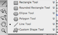 and held shift down whilst I created the line down the middle of the page, to create two pages. I then deleted the box, so that it would look professional. I decided to select the 'Horizontal Type Tool', so that it would be another layer, to create my drop capital so that I could move it and change the size, colour etc, in any way I wanted to. To create the pull quote I used the 'Horizontal Type Tool', and changed the surrounding tool so that it would look like a professional interview article from a music magazine.
I then added more text so that I would have 3 columns on the left, like a typical music magazine interview would have, adding pull quotes as I went, using the same technique I used for the previous pull quote and one column on the right hand side of the page.
I then decided to add the contents page numbers by selecting the 'Horizontal Type Tool', changing the colour and size the way I did it for the other text. After this I then added the photo that I had edited and had in another window, I then dragged it to my double page spread window by using this tool . I also used the same tool so that I could have my masthead on my double page spread from my front cover. To create the shadow behind my model I went back to the window from where I got my edited image from. I then selected the 'magic wand' tool
  , I then clicked 'Select', then 'Inverse' (shift, command,I), I then used the 'Brush Tool'
 , going over the areas selected so that it would create a black silhouette. I then changed the opacity on it by right clicking on the image, clicking on 'Blending Options...' and changing the opacity on the image, to make it look like a shadow.
 and changing the size of the text by using the drop down arrow
 .
.I then changed the style of my pull quote, by clicking on the 'Horizontal Type Tool',

clicked on the text, then I clicked on the drop-down arrow for the fonts
 , then changed the colour of the colour of the text by dragging my masthead from another window to my double page spread window, using this tool
  , then I clicked on the colour tool
 and clicked on the colour I wanted. After this I changed I selected the line tool
  and held shift down whilst I created the line down the middle of the page, to create two pages. I then deleted the box, so that it would look professional. I decided to select the 'Horizontal Type Tool', so that it would be another layer, to create my drop capital so that I could move it and change the size, colour etc, in any way I wanted to. To create the pull quote I used the 'Horizontal Type Tool', and changed the surrounding tool so that it would look like a professional interview article from a music magazine.
I then added more text so that I would have 3 columns on the left, like a typical music magazine interview would have, adding pull quotes as I went, using the same technique I used for the previous pull quote and one column on the right hand side of the page.
I then decided to add the contents page numbers by selecting the 'Horizontal Type Tool', changing the colour and size the way I did it for the other text. After this I then added the photo that I had edited and had in another window, I then dragged it to my double page spread window by using this tool
 . I also used the same tool so that I could have my masthead on my double page spread from my front cover. To create the shadow behind my model I went back to the window from where I got my edited image from. I then selected the 'magic wand' tool
  , I then clicked 'Select', then 'Inverse' (shift, command,I), I then used the 'Brush Tool'
 , going over the areas selected so that it would create a black silhouette. I then changed the opacity on it by right clicking on the image, clicking on 'Blending Options...' and changing the opacity on the image, to make it look like a shadow.
Subscribe to:
Comments (Atom)


