Thursday, 14 March 2013

Construction of Front Cover Background for My Music Magazine

Before I completely finished my music magazine I needed to change a few things to make sure that the final product look just as good and as professional as I want it to be. To do this I decided to have a look at which colour would suit my background the best, without it impacting negatively on my image and various pieces of text.

My first idea was to have a blue shade as it would keep to my colour palette. However when I looked at all the different shades and I found that a blue shade wouldn't work for my front cover as some were too similar to my blue that I was using for text and masthead. Other shades of blue just didn't look right as it looked faded and didn't fit in with the professional image I wanted to give my magazine. My blue ideas can be seen below:


(To create the image on the left I used Effects; 'Inner Glow', 'Bevel and Emboss' and 'Satin')

I also wanted to see if two shades together would create a good background so I decided to keep the blue, however applied 'Gradient Overlay' with 90% 'Opacity'. You can see my image below:


However for these image I changed the 'Blend Mode' from 'Normal' to 'Hard Light'. Then for the red image I changed the colour from the blue to red by double clicking on the colour block and choosing the red colour from my masthead.


Another idea I had was to have a light shade of blue so that it would keep in with my colour palette, whilst still keeping in with magazine conventions as they usually have a light background, the effect can be seen below:


For the second image I decided to keep all the effects the same, but change the 'Opacity' to 60% so that it looked white as well as blue, keeping in with the magazine conventions and my colour scheme. I still need to complete a few more tasks before my front page is finished, however this is the final colour I have chosen for the front cover of my magazine; INSPIRE.


Construction of Front Cover Image for My Music Magazine

After taking my images for my music magazine: INSPIRE, I needed to change them so that they looked professional and without imperfections. 


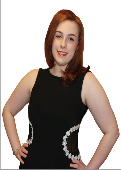
For my front cover image I needed to edit out the background to do this I used the magic tool, selecting the areas around my model so that the background would be edited out quickly and easily. However sometimes the magic tool didn't take out all of the images I needed so I used Eraser Tool to take out any unwanted parts. I also used the Clone Stamp Tool for the dress as there were grey areas underneath her arms and I used it for the flowers and the places surrounding as it didn't look good. I also used the Clone Stamp Tool for her hair as it looked messy and unprofessional. I also used the Eraser Tool to make her have a figure, as when I used the Clone Stamp Tool it made her look like she didn't have a figure when she does. However I tried to use as little photoshop as possible as I want my magazine to be about real life, with imperfections, instead of models who don't have a single hair out of place.

Construction of Contents Page For My Music Magazine

To start off my contents page I decided to create my text. I already knew what text I was going to put into my contents page, but it was just a case of typing it up and seeing whether it would fit and what changes should be made to make it look more professional. This is what it looked like below:

To do this I had used the 'Horizontal Type Tool', then selected the font type I wanted to use, then used the 'Toggle the Character and Paragraph Panels' Tool,  and selected this tool so that the cover-lines would stand out against the other text. I then selected the 'Set the text colour' Tool which allowed me to changed the colour of the text to red, the same colour as the masthead. (To do this I copied my masthead onto the same page selected the 'Set the text colour' Tool, then clicked on the red part of the masthead)


I then added more cover lines to the contents page, using the same technique as above, and then I used the 'Line Tool' and holding down the shift key to keep it straight, made a horizontal and vertical line, so that it would break the page up. I then added the masthead by dragging it into Photoshop and put it at the top of my contents page and at the bottom of my contents page. I then selected the 'Horizontal Type Tool',  and created a new text layer to create my title and contents page number.


After this I decided to put my main image on my contents page, to do this I opened up a new window of my image, which I had previously photoshopped, I then used this tool  and dragged it from that window to the window I had my contents page on. My next step was to put my front cover that I had made next to my subscription as this is what music magazines put alongside the subscription text. To do this I dragged it the same way I had previously dragged my image. I then opened my front cover in another window and dragged the background of that page and transferred it to my contents page, so that it would be exactly the same colour/style, and then pressed the 'command tool' and 'T' button on my keyboard and resized it to fit in my contents page. I then added my date, using the 'Horizontal Type Tool' and used the same technique I used previous. I then made my final image into      a JPEG, by pressing 'File', 'Save As', then pressed the drop-down arrow and selected 'JPEG'.

Construction of Front Cover For My Music Magazine

To start of my front cover I decided to add my masthead, to do this I needed open up a window with my masthead on (as I had already created it), and dragged it using this tool into my window for my front cover. I then created my text for my website and date (I already knew what style I was going to use for my front cover as I had already look at different style of text and which to use). To create my text i used the 'Horizontal Type Tool', and changed the font/style of the text by selecting my text using the 'Horizontal TypeTool' and clicked on the drop-down arrow and selected the style of text I wanted.  I then clicked on this tool  to change the colour of my text, I then clicked on this tool  to change the size of the text. I then used the same technique for my sell-line and other sell-lines, but the next step for my main sell-line was to add a drop shadow to do this I selected the text using the 'Horizontal Type Tool', right clicked on the layer in my 'Layers', selected the 'Blending Option...', I then selected the 'Drop Shadow' option when the box came up, and changed it so that the white text would stand out against the background.


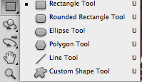
I then needed to add my image(I had already edited my image in another window), to do this I opened up my image in another window, I then selected the image using this tool , I then dragged this image from it's window to my image, I then pressed 'Command' and 'T' on my keyboard to re-seize it, so that it would fit. I then added my a bar code to do this I went on the internet and searched for a music magazine bar code and I then copy and pasted it into my window, and selected the layer, then pressed 'Command' and 'T' on my keyboard and resized it to fit. By putting this on I realised that I needed to add a box, so that you could see the bar code, to do this I selected the 'Rectangle Tool'
 and shaped it to fit around my bar code. I then double clicked on the box in my 'Layers' and selected a white colour so that it would keep in with my colour palette. After doing this I realised that I needed to add a background colour as it looked too bare, so I added a box, using the 'Rectangle Tool' and shaped a box to make up the background. To change the colour I double clicked on the layer in my 'Layers' and changed the colour to blue.
My last step was to save my product as a JPEG and upload it to Blogger.


Draft for Double Page Spread

For my double page spread I was going to have an imitation interview with Rita Ora as she is a well-known artist who everybody knows, but after careful thought and consideration, I realised it was better to have an imitation interview with Ally Rhodes, an undiscovered artist, as this is my unique selling point; having undiscovered artists/bands in my magazine talking about themselves and their music so that they can get discovered. This is what my magazine looks like now, as a finished product:


My draft for my magazine, before I changed it, to go on my final piece:

'Inspire: So Ally Rhodes, you've been having a lot of success in your career, and many people listening to your songs on Youtube, you must be pleased?
Ally: Yeah, I mean I'm so glad that people like listening to me!

Inspire: So why did you get into music?
Ally: I guess music was a chance for me to escape from my normal life and discover a new place where I can express my feelings.

Inspire: What inspired you to do your style in music?
Ally: Well there's so many great talents in the music world from different genres and backgrounds, so they inspire me to a version of that specific artist or genre and then I listen to other people and so I collaborate both artists/genres to create my own style, which hopefully everybody likes it as my music is really just a compilation of the artists and bands I aspire to be like.

From doing this draft I found that I needed do more questions and the answers to my questions needed to be more lengthy. I also found from doing this draft is that I needed to research what you need to put in a music magazine interview (so that I could stick to the conventions) and I needed to see what Ally Rhodes actually said in a previous interview so that I could find out what she actually liked/thought so that what i wrote down was both believable and factual.

Tuesday, 12 March 2013

Photograph Choices

From looking through other music magazine for my research, I have found that to keep to the media conventions I needed to have a close up or medium close up for my front cover, a long-shot for my contents page and double page spread.

For the image for my font page, I took many images and from that selection I decided to choose this image:


This is how it looked after I had Photoshopped it:


These are just a small collection of the photographs I took at the photo shoot that I liked but didn't decide to use because it wasn't the right shot (long shot), it was out of focus, it had reflection in her glasses, it wasn't from the right angle (low angle), it didn't have the right light in the image, her hair didn't look tidy, or her costume didn't look right.

Media corse work 032.jpg
Media corse work 035.jpg


Media corse work 038.jpg


Media corse work 050.jpg


For my main image for my contents page, I took many images and from that selection I decided to choose this image:


This is how it looked after I Photoshopped it:

These are just a small collection of the photographs I took at the photo shoot that I liked but didn't decide to use because the camera I used made the photographs come out too blurry, so I decided to use a better camera to get a better quality of images, so that it looked more professional. I also didn't use these images because they looked too similar to my other images that I was using for my front cover/double page spread as she was in the same position etc. I also didn't use them because the lighting  wasn't very good on the images. I also didn't use some of the images because the colours of the costumes/outfits that she was wearing didn't go with my colour palette. Another reason why I didn't choose these images was because some of them didn't match up with the media conventions in that they weren't the correct shot of my model.

Media course work 029.jpg
Media course work 019.jpg
Media course work 018.jpg


Media course work 004.jpg

Media Homework - 014.jpg

Media Homework - 019.jpg
Media Homework - 030.jpg 
Media Homework - 034.jpg


Media Homework - 044.jpg


Media course work - 053.jpg


For the image for my double page spread, I took many images and from that selection I decided to choose this image:

Double page spread unedited.jpeg


This is how it looked after I Photoshopped it:

a print screen from final piece (Double Page Spread2)


These are just a small collection of the photographs I took at the photo shoot that I liked but didn't use because they didn't go with my idea either because; my model wasn't using the correct expression to give the right connotation for my article, it didn't have good picture quality, she wasn't in the correct position, the pose looked artificial/forced, she wasn't fully in the shot or that it wasn't the correct shot (close-up etc).

Media course work 002.jpg
Media course work 005.jpg

Media course work 008.jpg


Media course work 015.jpg


Media course work 018.jpg
Media course work 020.jpg